Thursday 28 April 2011

WASTE can be a piece of ART

Stuff i did with unwanted magazines, cardboards to become a piece of art.

Collage done with unwanted magazines.


Using unwanted cardboards to make into a book holder.


Project Radical // Skateboard . Thrash Bag . Typography

Project Radical is a project where I used different methods to remind people that the way they are living in a world of consuming more than what they need and that all the thrash people are contributing will become a disaster when things get out of control. 


Cutting the letters out from a flimsy thrash bag.
A poster to remind that they are throwing their own lives away when they contribute toxic waste.

Bringing the typography poster to the unwanted skateboard.

RIDE OFF WASTE.

Exhibition to showcase our works.

Project On Joseph Muller Brockmann

A 3d project on one of Joseph Muller Brockmann's poster. 


http://blog.iso50.com/wp-content/uploads/2008/04/815.jpg

By using unwanted cardboards to recreate a poster.

The Final Product


Portfolio Design // Laser Die-Cut Wood Craft

A design for my portfolio cover. Used a binding technique I created on my own for the ease of updating pages in the portfolio. When the elastic band on the left side is removed, I can attached pages inside the portfolio with ease. The trick is that I have to created a slip on the top and bottom of the pages like the hard cover. The hard cover of the folio will then take the tension of the band and my pages will not be crumpled.


Wednesday 27 April 2011

Typeface Design // Sankkakei

The Universal Typeface Of Art and Science
For this project I am supposed to design a new typeface for this event the ArtScience Design Awards that I proposed to be held in the ArtScience Museum of Singapore. I chanced upon this website http://www.princeton.edu/~artofsci/gallery2010/ while I was browsing through the net for subjects that relates to both aspect of art and science. With the subject picked for the event, I then created a new typeface that has the aspect of art and science.
Sankkakei Tyeface
The Setup
A mini case for the mini phamplet

The mini case is made of white acrylic

The mini phamplet

Synopsis of the printed matters

The event poster


Font Diary Case

Design of the book case

Font Diary
Mini Case
The INVITATION in a testtube


MERCHANDISE // ALL THINGS 828

ALL THINGS 828 is a Christian branding where they sell stuff that got to do with the teachings from the bible. I was given this brief with this psalm ; "Surely goodness and mercy will follow me all the days of my life." The interpretation of the key words in the given psalm, which are the ‘goodness’ and ‘mercy’ are being portrayed into two different characters for the company’s merchandise. These characters has a cult-like following for fans who are interested and will be demanding for more and more product ranges from the company. The goodness character is said to have a feel of Jesus himself.


The laser engraving on bamboo wood is from this company GROVE. More details can be found here http://www.grovemade.com


Typeface Design // Bekkei

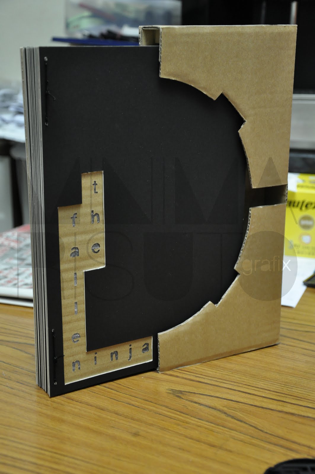
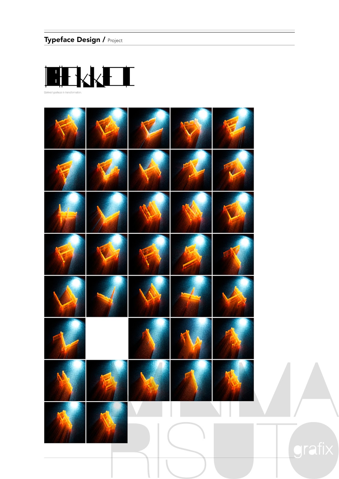
For a project, I have to design a typeface based on my character with the comments given by my friends. Most of my friends sees me as a 'clean cut' person. Therefore, based on the word 'clean cut',  i created a typeface that i named 'BEKKEI' which means another form of character. Bringing the concept of sleek and play together, the very first try-out was on the material balsa wood. The idea of creating a play on my typeface was with a connecting joint on the top of the alphabets when being joined together. Slit holes with defined straight edges was cut out from on a 1cm thk thick balsa wood to create a 3D dimensional effect on the typeface. 

To further express the clean-cut feel, perfect cutting done with the laser machine leaves no room for imperfection. However, the earlier concept of creating interaction was not very well developed, leaving room for improvements. So, using that clean-cut slit idea, i tried to do a typeface where different alphabets and numberings can be acheived through interlocking of a few pieces of acrylic blocks with slits on it. The initial stage of making this typeface was to test out on pieces of thick cardboards that substitute the acrylic. 

The reasons are to properly locate where to position the slits on each different pieces of acrylic blocks, to maintain the sizing and to decide on the design of the alphabets and numbers. Most importantly, the aim to achieve the Type family with lesser pieces of acrylic blocks. The whole idea was to create interaction through inter-locking and transforming to achieve the typeface with the acrylic blocks. Changes were made to ensure typeface could be legible before working on the actual material. The end result was 15 pieces in a set to complete alphabets A-Z and numbers 0-1 formed with various sizes of blocks.


BEKKEI TYPEFACE IN TRANSFORMATION
BEKKEI TYPEFACE
MOODBOARD - SLEEK STYLE


MOODBOARD - THE MAKING


MOODBOARD - CLEAN CUT

MOODBOARD - PLAY INSPIRED

MOODBOARD - BEKKEI

MOODBOARD - PLEXIGLASS
POSTER 1 // NOTHING TO HIDE

POSTER 2 // STILL FRESH

POSTER 3 // NEVER BEDRAGGLE

The setup of the mood boards and posters are all being printed in transparency and then overlaying the contents with acrylic panels to create a depth when viewing it over the light box.